Information Cards
Tool: Adobe XD
Problem
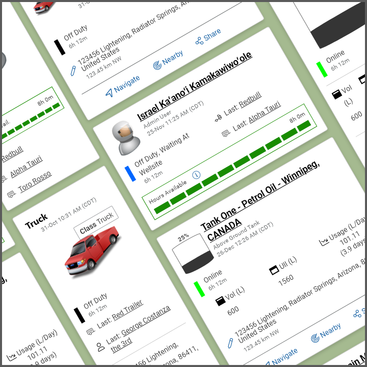
Clients require a quick overview of their assets. Different information is helpful or must be shown based on the customer’s industry. Trucking companies want to know who’s in the vehicle and what trailer they’re pulling. The oil industry wants an easy visual of how much is in their tank. The driver wants to know how many driving hours are left before their teammate must take the wheel.
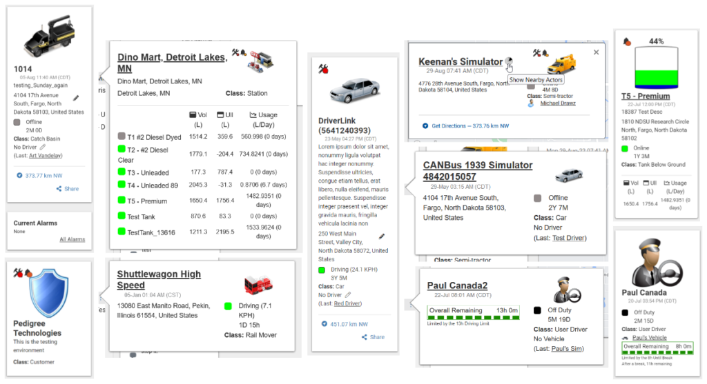
Initially, the information card had information and data added as other clients required different needs. As the data was tacked on, the card became disorganized.
Objective
Create a clean, easy-to-consume, standardized card layout in a vertical and horizontal view.
Business requirements
The new design needed to be easy to scan and standardized. There needed to be a vertical and horizontal layout for both mobile and desktop views.
- Easy to scan
- Remove unnecessary clutter
- Responsive design for mobile and desktop users
Who
UX Designer. Responsibilities included research, wireframing, prototyping, requirements documentation, and usability/design testing.
What
Information cards in horizontal and vertical layouts for desktop and mobile devices, deployed February 2023
When
Initial update – November 2022 – February 2023.
An ongoing project as customers request additional updates that cannot be adapted elsewhere.
Where
Pedigree Technologies, Fargo, ND
Why and how?
The existing information card was cluttered with information tacked on with no hierarchy or formatting. The mix of labels, icons, colors, and headers was inefficient for scanning information or mobile devices. We needed to determine what information was essential to be shown to the customer and in what order.
Research
Where do we start?
The company services multiple industries, including oil and gas, construction, and transportation. Initially, my designs included all the current information. There was a lack of understanding of what the customer desired and what they found essential. Once the design process kicked off, it became apparent that there was redundant or unnecessary information. Each card needed a standardized look while containing critical data for that specific asset.
Design Patterns
One of the flaws of the original design was the lack of flow to the information. There was a zig-zag feel between icons, text, and sizing. With a lack of breathing space and division between each section, users were expected to consume all of the information instead of being able to pinpoint the data they needed quickly. Frankly, it was overwhelming and cluttered.
QA Influences
As a former Quality Assurance Engineer, I am drawn to the details. Alignments, colors, and consistency between features, components, and other pages were pulled to help redesign the information card. I wanted the user to feel as though this was fresh and clear without feeling out of place.
Developer Needs
Given my stint as a front-end engineer, I wanted to be sure the design could accommodate additional changes. Given the requirements, I considered the component names, sections, and spacing required for updates. Standardization visually and technically allowed for a seamless transition from design to deployment.
Finding Inspiration
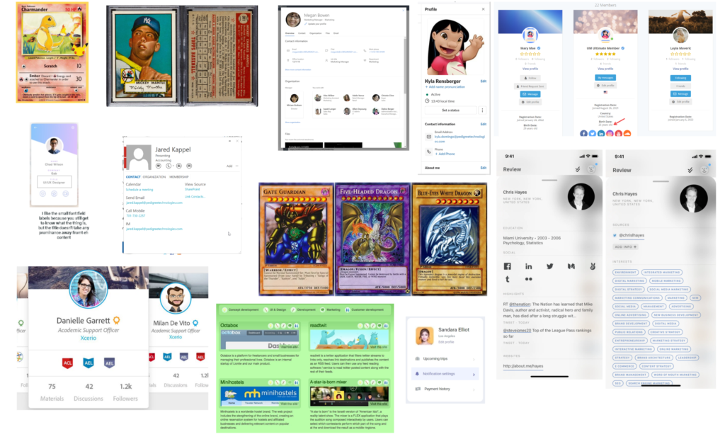
Stakeholders asked for inspiration from Slack, Facebook, LinkedIn, Pokemon, and even baseball cards! Because customers require unique attributes from any given asset type, there needed to be some flexibility. In the future, adding more content to this card or allowing the customer to customize certain aspects is possible.
Design
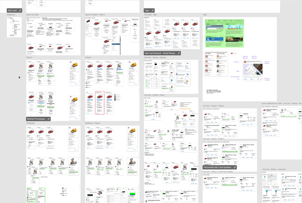
Once the initial nuances of each asset were determined, I created high-fidelity prototypes in Adobe XD, following the Nielsen Norman Group guidelines. There were fine tweaks over multiple iterations, considering both desktop and device sizes. Though some designs were appealing, they had elements that were too novel for the needs of our users. It was decided that a more minimal and balanced approach with visual grouping gave the cards a cohesive look.
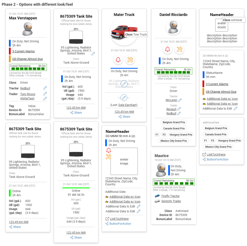
Standardized Layout
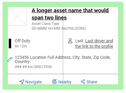
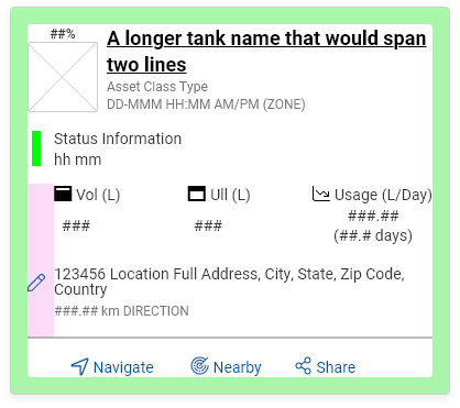
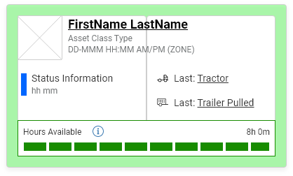
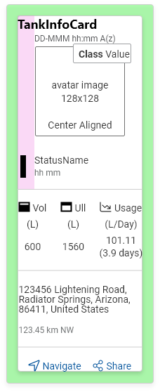
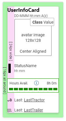
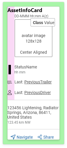
Standardized layouts were created, starting with the top three asset types that customers would use. Because most decisions were made with only the stakeholders included, initial prototypes were fleshed out with pictures and data pulled from the testing environment. As I finalized the iteration requirements, I used placeholder text and images to appeal to both Quality Assurance and Developers. I wanted the engineering team to understand the nuances without the distractions.
Below are the wireframes of the three asset types deployed within the first iteration. Pixel sizing for each highlighted section and alignment was identified within the user story for clarity.
Key Takeaways and Feedback
Takeaways
Appealing to multiple industries and their needs can become cumbersome and lead to significant analysis paralysis. Determining which items/assets/features were most important allowed us to progress in the project.
Committee decisions can hinder the forward momentum. With a lack of customer feedback, I sought out users who had interactions with users to provide me the insight into what the user required.
A well-designed card can have a lot of information and still look clean.
The stakeholders required prototypes that showed the worse case situation to feel confident that the design was appropriate.
As one of my first more significant design features, I referenced a lot of standards while presenting to give the stakeholders confidence in my designs.
There is value in having wireframes and understanding the customer’s situation. I felt pressure from stakeholders to provide high-fidelity prototypes without considering the user’s needs – – we don’t know what we don’t know. Still, we can do research before showing “pretty” pictures.
Feedback
“It looks super clean and is a well-needed change! The [share and navigation] links are visually appealing.” – Lynette, Customer Training Manager
“There is so much information to display in a small area, with the added challenge of changing the type of data to be displayed based on the user. These actor cards give users all the info they need at one glance, plus extra info on hover if needed. ” – Meg, Quality Assurance Engineer
